Research point: Artists’ self portraits

Investigate some artists’ self portrait, both well known artists and lesser known artists.

Edward Hopper (American painter, 1882-1967)

Edward Hopper young charcoalWhen thinking whom to select, Edward Hopper came to my mind whose self portraits I had seen in the recent Hopper Exhibition, showing him as a young man and again later in his fifties. The later portrait showed much more of his personality and presented him as a real character, whereas the young man looks in a way like a blank sheet.

I found it interesting to compare the self portraits with photographs of Edward Hopper. The earlier one dates back to his highschool graduation in 1899 at age 17. The later one shows him in mature age, maybe 50?

Edward Hopper 1899 High School graduation Edward Hopper photograph

It’s also interesting to compare the three self portrait at older age which were executed in different media. The black and white drawings are later, both from 1945. I saw both of them at the Hopper Exhibition but unfortunately did not take pictures, so I’m including images from the web instead. It can be seen that one of them, which is indicated as made with conté pastels, is much softer, compared to the other one. I think that other one was made using a soft pencil or some other medium that permitted crisper contours. The difference was visible in the online exhibition as well, it’s not only a problem of web image quality.

Edward Hopper 1945 Self portrait, conté on paper 70.287

It really fascinates me how masterly Hopper made the tonality of this drawing.

Edward Hopper c1925-30 Self portrait oil on canvasThe much earlier oil painting (c. 1925-1930) also has this mastership of tonality, only here this is translated into colours in a very generous way without unnecessary detail.


Vincent van Gogh (Dutch painter, 1853-1890)

Vincent van Gogh 1889 Self-portrait without beardI’m a great admirer of Vincent van Gogh and therefore included him in this research. The first self portrait I chose surprised me because I thought it was a portrait of Vincent as a young man, but then learnt it was the last self portrait before his death. I perceived the expression in his eyes as very broken and lost. It was the only self portrait without a beard. Van Gogh himself seems to have been conscious about this and titled it “self portrait without beard” (1889).

John_Peter_Russell,_Vincent_van_Gogh,_1886Only three years earlier dates a portrait of van Gogh by John Peter Russel. I find it striking how different van Gogh’s personality comes across. In that portrait, van Gogh is depicted as a respectable, confident, yet a bit suspicious man, with a small brush indicating his profession.

Van Gogh died when Edward Hopper was a child, and photography was only in its beginnings. The wikipedia article on van Gogh’s self portraits included only one photograph which might or might not show van Gogh, experts are said to disagree. So I took this portrait as the corresponding “other” view on the artist, instead of a photograph. Where Edward Hopper resembled closely the photographs of him, I perceive much difference between Russel’s portrait and van Gogh’s self portrait. It may have to do with the effect of using a mirror for self portraits, compared to the direct look of someone else, which switches the left and right side of the face. But then, Hopper’s self portraits should exhibit a similar bias, but I don’t see that.

van Gogh 1886 Pencil self portraitThen I selected the very earliest self portrait I found, made in Paris, Fall 1886, at age 33. A date comparison made me realize that van Gogh died as a young man, at age 37. There were only 3 years between this and his last self portrait without beard. In these three years, van Gogh has produced 36 self portraits, most of which were in oil on canvas. This is roughly one self portrait per month – and this does not include all the other paintings and drawings made in these years, including those that have gone lost in time. He must have painted like furious!

Vincent van Gogh 1889 Self-portrait with bandaged earVan Gogh depicted himself mostly with the nose pointing to the left, in particular in the later self portraits after he had mutilated his ear. But there are also some that show his ear bandaged, for example the “self portrait with bandaged ear” (1889).

Vincent van Gogh 1887-88 Self portrait with felt hatI found the self portrait with felt hat (winter 1887-88) stood out from the others through the choice of colour and technique. Most other self-portraits are more naturalistic in colour and combin and blend colder and warmer tones, whereas this one has a dominant contrast of black, an ultramarine blue and wine red. Skin and hat appear pale. The technique resembles woodcut, with the blue brushstrokes for the suit like carved out from the black background, and wine red smaller strokes in circles around the head for the background. The accompanying text explains that this painting reflects the influence of Pointillism on van Gogh, who lived in Paris at the time.

Vincent van Gogh, Summer 1887, Self portraitAs a last self portrait by van Gogh, I chose the one I found most naturalistic. Maybe this one is closest to the view other people had of him and how he was portrayed by Russel. For me it is one of the few that are not “somehow strange” by the choice of colour or technique.


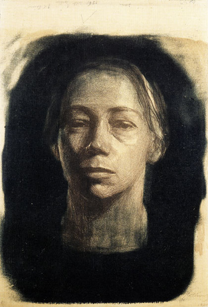
Searching for less well known artists, my first idea was Georg Kolbe whose figurative drawings I had admired. But I couldn’t find any self portraits by him. Meandering a bit through the image world, I stumbled across a self portrait by Käthe Kollwitz, a German painter and printmaker.

Käthe Kollwitz (Germany, 1867 – 1945)

She was approximately a contemporary of Edward Hopper, born around 20 years earlier in Germany. Van Gogh’s death was in her early twenties.

The first self portrait I chose shows her with head leaning on the hand, 1889-91, Pen and ink on paper. I love this one for the attitude it conveys, which reminds me of my own self-portrait in coloured pencil. It conveys something of teenage rebellion. Käthe Kollwitz was in her early twenties when she made this self portrait. She used a mix of pen and ink and washes for tonality. This was combined with hatching to create tones. The technique supports the unconventional and experimental overall impression of this self portrait. I found a photograph at presumably more mature age with a similar posture and somehow there’s much correspondence to the personality that comes across in the early self portrait.

Käthe Kollwitz 1889-91 self portrait pen and inkKäthe Kollwitz photograph

Käthe Kollwitz self portrait watercolourI found another self portrait at relatively young age. Unfortunately there was no corresponding documentary information, but I found a reference elsewhere which indicates the date as 1903-04. It looks like a technique combining watercolour washes with charcoal. There are very deep contrasts from very dark to very light but the blendings are subtle.


The next self portraits I chose are from older age. I’m impressed by the courage she had in depicting her wrinkles and other signs of age in her face. I remember that in my own self portraits I was less courageous and had a tendency to leave out “ugly” aspects. Maybe that lack of courage to depict what I saw resulted in drawings that did not really resemble me…

Kaethe-Kollwitz-Selbstbildnis-1924 Käthe Kollwitz self portrait charcoal

1931 (ca.), Portrait of Kathe Kollwitz , circa 1931 220px-WP_Käthe_Kollwitz

Käthe Kollwitz 1926-32 Self portrait bronzeAs the last self-portrait from Kätze Kollwitz I chose a bronze sculpture which is dated 1926-1932, where she was in her sixties. It’s a nice reminder that artists’ self portraits are not restricted to two-dimensional works.


Overarching aspects

Influence of the times – how each artist can be located within influences of contemporaries and predecessors, and how history influences the production of art.

Comparison between young and old – Not only changes the perception of self throughout life, so does its depiction in self-portraits.

The subjective vs the objective view – The self-portrait as a subjective view, can be similar or very different from the outsider’s view through a camera or portrait.


References

Edward Hopper

Whitney Museum, Edward Hopper Self portrait, Oil on canvas http://whitney.org/Collection/EdwardHopper/701165

Edward Hopper Photograph http://americanart.si.edu/search/artist_bio.cfm?ID=2297

Edward Hopper 1945 Self portrait, conté on paper http://phillippblog.blog.de/2009/10/05/edward-hopper-46-epilog-7101636/

Edward Hopper 1945 Self portrait, medium unknown http://www.nysun.com/pics/9049.jpg


Vincent van Gogh

Wikipedia article on the artist’s self portraits http://www.nysun.com/pics/9049.jpg


Käthe Kollwitz

Käthe Kollwitz Museum Köln (available in English) http://www.kollwitz.de/en/default.aspx

Self portrait 1889-91 pen and ink http://www.kollwitz.de/swf/zeitstrahl/bilder_zeitstrahl/48_N_T25.jpg

Käthe Kollwith photograph http://3.bp.blogspot.com/-NOQ_KK6j_Ic/Tj9TWsDXLiI/AAAAAAAAApQ/8QD7pi2t-0Y/s1600/kollwitz.jpg

Watercolour self portrait http://museen.de/bild.php?id=9918555&w=feat , corresponding image dated 1903-04 from http://le000310.host.inode.at/bilder/Kollwitz_Kaethe_Selbstbildnis_1903_04.jpg

Bronze sculpture http://www.kollwitz.de/module/werkliste/Details.aspx?wid=403&lid=8&head=Tour+-+Self-portraits&ln=e

Posted in 4: Drawing figures, Research points, Self portrait | Comments closed

Self portrait

I feel that I’ve finally got where I wanted to be all the time! Let’s see whether I can make something out of this project.

Exercise: Drawing your face

The task

– Draw several five-minute sketches of your face from different angles to face and head
– Draw five more quick sketches focusing on the overall shape of the head without the neck
– Draw the shape of your neck repeatedly until it looks right

I made three self portraits in the A4 sketchbook. I think I took slightly longer, maybe 15 minutes per sketch. None of them really resembles me and they are all somewhat distorted.

P1060111P1060113P1060115

P1060116I then proceeded to drawing the shape of my head. I wasn’t able to make sense of the exercise. I saw my head as an oval, so I’d draw an egg shape and that was it. In the second oval I sketched some of the hair outline plus marks for eyebrow and nose positions. But I could not make anything meaningful out of the task.

With the shape of my neck I had a similar experience. I drew my neck as two parallel lines plus some more lines to indicate the position of horizontal bones and the throat muscle. What would that be, a loose neck without the form of the head or torso? I found this task entirely meaningless.

Exercise: A self portrait

P1060123I began with searching a comfortable position and placing the mirror. The first portrait was with the head bent backwards onto a cushion. The light wasn’t very strong and this may have facilitated my focus on essential simple shapes. This portrait is a successor of the earlier one in A3 on grey paper when I began with figure drawing. The traits are a bit distorted but there’s much more resemblance than with the other portraits.

P1060125For the second self portrait I chose coloured pencil. I started with a very light yellowish brown and was surprised how well this worked to model something three-dimensional. I gradually added darker tones and increased intensity of colours. It really felt like sculpting a form. I’m very satisfied with this drawing. It’s like a breakthrough because I found a way how to draw the tonal shades that create three-dimensionality. There’s also considerable resemblance with my face.

Both self portraits are small, I chose an A5 format. The small format works well for slowly building up tone using coloured pencil. I remember the drawing with flowers in coloured pencil which was supposed to be done in A3, and how the sheer size of the paper was so discouraging.

Exercise: Portrait from memory

The task

– Make notes about: situation and mood of the person; position of the head and direction of gaze
– draw quick preparatory sketches of the head and individual features until you feel confident
– draw the portrait of someone else or a self portrait from memory

I decided to make a portrait of a colleague, Susanne. I don’t have a very good memory and drawing a face from memory is something I’d not normally attempt because I’d be quite sure that it wouldn’t resemble that person. I once was close friends with someone and hadn’t even been aware that he had a beard for a while and then had shaved it off. So I was quite certain not to produce anything remarkable for this exercise.

My main visual memory of my colleague was her hairstyle, medium length with a pony that was roundly cut to frame the face. I also remembered her expression as friendly but with a slight tense trait around the mouth. So in the sketches, I mainly tried to get the hairstyle and the mouth somewhat similar to her. The subsequent drawing was again on A5 size and 4B pencil. I included both features and it looks more realistic than I’d have thought, although I’m quite sure there’s not enough resemblance for other people to know who that person would be. The sketches are in the A4 sketchbook, the drawing is 4B pencil on A5 paper

P1060119P1060121

Posted in 4: Drawing figures, Self portrait | Comments closed

Check and log: The moving figure

How well did you manage to create the sense of a fleeting moment rather than a pose?

Maybe this is something that worked relatively well in my drawings, as I tend to have a non-perfectionist style and am impatient and prefer less to more. So in a way all my drawings have something unfinished in them which seems to correspond well to the idea of fleeting moments.

How successful were your attempts to retain an image and draw later?

These attempts were rather unsuccessful.

Were you able to keep to a few descriptive lines to suggest the person’s movement or were you tempted to keep introducing more elements into your work?

Most of the time, I wasn’t able to do any more than draw oversimplified linear sketches of a real person moving before me. This was a repetition of my inability to draw my cats as soon as they were awake and moving. The solution was to draw from a photo and then there was enough time to draw the entire figure, not just descriptive lines. So I must say that I haven’t found a solution to the task of drawing moving people.

Posted in 4: Drawing figures, Check and log, The moving figure | Comments closed

Research point: People watching

I had tremendous difficulties with this task. Firstly, I wasn’t able to observe people as intensely as would be required for later drawing them. It would have amounted to staring at them for prolonged times, and I felt this was socially not acceptable. I did not want to make people feel uncomfortable by staring at them, and I did not want to feel like an offender to social rules.

Then secondly, the minimum amount of time I considered socially ok for observing any particular person was not enough to build up my memory for later drawing. I also tended to feel overwhelmed with visual impression and had a hard time focusing on anything particular because the memory of any observation tended to be wiped out by the subsequent observations.

P1060382There was one image I drew from memory, it was that of a young girl riding in the bus, sitting opposite of me. This drawing is in my “moving people” sketchbook. It is better than I had expected as far as the amount of detail that I was able to remember is concerned, but overall it is a rather weak and faint drawing. Maybe drawing from memory might work better if I could draw immediately after having watched someone. For now this is difficult to organize with my fulltime working schedule which keeps me overbusy and exhausted.


Posted in 4: Drawing figures, Research points, The moving figure | Comments closed

The moving figure

This project frightened me because I vividly rememberd how badly I did with the animal drawing project. The moving figure is a real challenge since I have so many difficulties drawing still objects that I don’t know how I might ever succeed in drawing moving objects or people…

Drawing moving people is also a problem of opportunity and self-confidence. I’m not normally the person to sit somewhere and draw other people where I might be observed by passers by. Ideal would be a place by window towards a lively location, but currently I don’t know anything suitable. I’ll probably have to resign to TV or video for this project.

I checked this morning whether TV might be a useful source, but I found this problematic. Typical TV transmissions move quickly and they have cuts every few seconds where they switch from close up to further away, from a single person to a group and back etc. It would be impossible for me to focus on anything particular. I thought of two alternatives:

– Still TV/Live Web Cam where a camera has a fixed viewpoint and just films whatever happens to be on the scene. This would give time to draw the setting and then add moving people as they pass along

– Live TV of someone holding a speech. This will not exactly be a moving person, but there’s a chance that the camera will be held still and not constantly interrupt with cutting through the sequences.

Exercise: Sitting and waiting

I really don’t know how I could do this exercise following the task instructions, other than using photographs or search for particularly usable videos. But then the entire idea of capturing characteristics from moving people is lost. I have no place to go where I could practice drawing like this and I’m too shy to draw in public. I’m afraid, this one’s not for me.

Searching for live webcams
– New York would be great, but I might also change location to have a daytime camera when it’s night in New York
– Image quality of live webcams is generally very low. Enough for locating persons and drawing bold sketches. But some HD webcams are available where image quality isn’t that bad.
– The Times Square webcam is very cool, but tends to be far away from the people. I’d prefer something a bit closer. Maybe a California webcam of a frequented place during daytime?
– At 8 p.m. in New York, it’s early morning in Bangkok. And indeed, there are some webcams in Thailand. They are not abundant in Asia. Unfortunately the quality isn’t very good.
– Australia and New Zealand? Nay… nothing suitable either
– Found a live webcam in London. But it’s night there and the view is quite tilted. I’m finding it not busy enough, with only a passer by every now and then, plus some occasional cars. Might be more interesting during day time

I don’t want to wait until the next day or when some time in the future I find a place where I can draw people. I think for now the most practical solution would be to use photographs from the web. I’d be interested in restaurant views – inspired by the Chocolat Cancing drawing by Henri de Toulouse-Lautrec included for this exercise.

Google image search
– Restaurant: shows mostly the location, no people
– Bar: the same
– People in restaurant: works better! Many crowded places. But typically too many people and too anonymous. I’d like to have something with a more familiar character
– Friends in restaurant: Not much difference
– Friends in bar: focus on people drinking
– Picnic: focus on food
– Friends picnic: seems to work!

The only problem is that these images are still and thus the central idea of capturing something from moving objects is lost.

So I decided to give TV a try and just have a go.

P106010715 minutes later: Basically doesn’t work, it is as I anticipated. Images move too fast and totally unpredictable and drawing from TV is quite unpleasant for that reason. I made two drawings in A5 with 4B pen. The first was a sports commentator who was talking in close up to the audience. But I did not get further than the outline of his head, then the view switched to show him with a colleague. I tried to draw them both but the picture again switched immediately and I only could draw two outlines.

P1060109I switched through the various channels and made the next drawing of someone holding a speech. I think this drawing isn’t so bad. But then he took off the glasses and turned his body and so I stopped that drawing. I did a complete search through all the 100 or so public channels I receive, but there was no program slow enough to permit drawing.

My main conclusion from these first attempts is that I cannot schedule this task and that it might be wiser to just carry around a sketchbook and try to draw people whenever there’s an opportunity for the remainder of the course. So I’ll treat this project differently from the others and try to work on it alongside continuing with the next project. I’ll add more drawings to the blog as I make them.

Exercise: Fleeting moments

This exercise entails observing people and drawing later from memory.

How I’m going to work on this project?

I think I’ll write myself a briefing for both exercises and the research point, print it out and carry it around together with a sketchpad for the next few weeks. In view of the nature of the tasks, I don’t think it is possible to schedule the drawing occasions. I’ll have to take them as they present themselves, this will not be neatly ordered according to the sequence of the exercises. So basically I’ll just try to make a collection of people drawings and see where this gets me, with a review in 2 to 3 weeks or later.

Briefing: The moving figure

Aims: Acquiring practice in rapid drawing
Materials: Small sketchpad and supply of different drawing tools, for example ballpoints, marker pens, soft graphite pencils, coloured pencils. Switch between mediums and use more than one if you like

General instructions
– Focus on action not the outline
– Use quick exploratory lines to express the overall flow and movement
– Make notes:
– Your response to what is happening around you
– The reason for a particular movement, why has it caught your attention?

Exercise: Sitting and waiting
– Draw small and increasingly larger groups of people
– Keep up a fast pace of the sketching
– Identify the principal character and draw them first

Exercise: Fleeting moments
– When something interesting happens and you cannot draw right there and then, observe and draw later from memory
– Focus on particular important aspects, for example
o Narrative: the reason for movement
o Focus: interaction around a main character
o Line: the stronges gesture or movement
o Props: Chairs, bags, the movement of clothing and so on
– Focus on the essential, be minimalist
– Try to fill a sketchbook page each day

Research point: Watching people
– Observe closely when you are with other people
o How they stand, what they are carrying, what they are doing with their hands, what their chins are like, the difference between a man’s head and a woman’s
– Do some immediate sketches if possible
– Otherwise, draw later from memory
– Record your observations in the learning log

Well, I think these instructions are too many to keep in mind or follow simultaneously. I think I can retain at a first time that I’ll be out to search opportunities to draw people and if I cannot draw, observe unobtrusively and draw later.

References

Live webcams in the state of New York, USA http://www.camscape.com/North%20America/USA/New%20York/index.html

Times Square live webcam with several different views http://www.earthcam.com/usa/newyork/timessquare/

London, Sussex Garden view live webcam http://www.camscape.com/view/32016

Posted in 4: Drawing figures, The moving figure | Comments closed

Check and log: The clothed figure

Did you find it easy to approach the figure as a whole or were you distracted by details of the sitter’s dress?

I think I was at times too focused on details of the folds. But most of the figures work quite well as a whole. Still I think my folds do not really work, because the hatching doesn’t correspond well to the linear marks I made.


How did you create volumen in the folds of the fabric?

Creating volumen worked well when I used the pencil to create shades rather than hatching. Where it worked, there was a close correspondence between the general line for the cloth’s form, and the hatching to set off the darker areas.


Does the finished drawing give a sense of the figure beneath the fabric?

Yes, I think all the drawings provide a relatively good sense of the figure, although the proportions look a bit strange in those drawings where I put my feet on the chair legs instead on the floor.


How would you tackle a drawing like this again?

I think before starting a complete drawing, I’d make more studies with a soft medium like pastel which permits to create subtle blendings between dark and light tones. Selecting just a tiny section of a draped cloth seems to work well for me to reduce the overwhelming effect of all the folds.

Then I’d have to practice hatching and slowly bring together my line drawing and hatching to set off lighter and darker areas. I think as the final picture I’d rather envision a painterly effect where the folds are indicated by economical darker and lighter shades, reducing detail and avoiding exaggerated contrasts.


One more thought

I feel that I made some progress in my approach and working style. Maybe for the first time I was consciously reflecting while working on the task and then trying to change things which I felt didn’t work, for example change of paper size and trying different mediums.

Posted in 4: Drawing figures, Check and log, The clothed figure | Comments closed

The clothed figure

Exercise: Fabric with line and form

This was a funny exercise. Instructions were to throw some fabric across a chair, then make two 15-minute sketches using only line. My cat Gina got crazy when I threw the cloth… she jumped on it while it was moving throughout my attempts to throw decently to get some interesting drapes… she chased after the cloth and tried to run away with it. I finally had to close her out of the room to get my throwing done, then allowed her back to keep me company.

I chose A3 paper and charcoal for the first, then 4B pencil for the second sketch. I wanted the large size to permit some arm movement. I switched to pencil because I found the charcoal lines a bit too bold.

P1060080 P1060082

The next task was to draw 5cm squares and depict tonal details of the folds. I stayed with A3 size and 4B pencil, but started in the middle of the sheet to see how many squares I’d be able to draw before exhaustion.

P1060084I was puzzled because my folds were interesting abstract shapes but not recognizable as cloth folds. I was surprised how much of my draped cloth fitted into the tiny area. I continued and made 7 little squares in total, some are repetions of the same sport or just slightly moved because I found these were the most interesting areas.

I don’t think any of my miniatures is particularly recognizable. I think this is because the colour contrasts were too strong. I thought how I had been glad after the previos exercise that I finally managed to be a little bolder and create dark marks, now this exercise rather asked for subtle tonality… so basically it didn’t work.

Exercise: Form and movement in a clothed figure

P1060085I started this exercise with new energy on the next day. I had no problems deciding on a nice arrangement, simply took a wide light summer overcoat and took place in front of the mirror. I developed interesting positions, but then realized that I’d have the same problem as always, the limitations of observing and being observed simultaneously. In other words, to draw myself, I had to move the arm and I was constantly in my own way.

I made a large drawing when I finally had found a position that was different from earlier positions and permitted to draw much of the figure. I had placed the drawing pad on a small easel and sat directed towards the table. It was a nice position but I wasn’t able to work  out the drawing because my arm went lame.

While drawing, I realized several things. Firstly, the large paper size was in itself disturbing because it covered most part of the figure if I held it upwards in front of me. So I decided to switch to a much smaller size and continued with an A5 pad.

I also took off the coat and draped a white blanket around myself be because I wanted to try out the task with a different kind of cloth.

I became aware of the huge difficulties with the instruction to use hatching to create tone. With each drawing, I began with line, and as soon as I tried to introduce tone by quick hatching, it seemed to be all spoiled. Over the course of my sketches I switched  to a more subtle handling of the pencil which avoided linear marks and created tonal areas instead. I think this is a technique to create more subtle and realistic effects. It wasn’t even conscious, I automatically turned to this technique because it felt more appropriate to my aim of getting the tones right.

P1060088 P1060090

P1060091 P1060094

But then I thought that the instruction to use hatching must have a deeper sense and that I shouldn’t just ignore it. So I switched to black pen with the aim of preventing myself to slide unconsciously into a different mode of drawing. There is one area in this drawing where I think the hatching looks good and actually works, that is on the right side where the cloth falls over the leg with the bare foot.

P1060096Analysing the drawing I thought that maybe the black colour was my problem. I was drawing white cloth and every hatching mark created a strong contrast which seemed to destroy the lightness of the folds. I wanted to stay with a medium that permitted no tonal variation and thought that coloured felt pen might work better. I had the idea of making a coloured drawing using light grey felt pen for the white cloth. Then the hatching to depict shades on the folds would be made in a light colour and thus be more subtle in effect.

P1060099I only had smooth paper in A4 size, so switched to the larger format for the next attempt. I thought to begin with a light pencil outline and chose a H pencil to prevent smearing and because I wanted only light orientational lines. The drawing then developed differently, because I began to try out hatching with the harder pencil. I postponed the felt pen idea and tried to work out the pencil drawing. My cat Gina hopped on my lap, I moved and the drapery was all curled up, so I stopped this drawing before I felt it was ready.

P1060101The final drawing was done with grey felt pen. I meant to choose a lighter tone but it looked darker than anticipated on the paper. The drawing more or less works, but for the hatching I think I need more practice with that technique. I remember that there were exercises in part 1 of the course. I’m not very comfortable with the technique.

What I found really strange was that I felt that hatching was not the best technique for the purpose. On the other hand, I quite liked the results even if the hatching wasn’t very subtle.

Posted in 4: Drawing figures, The clothed figure | Comments closed

Check and log: Structure

How accurately did you depict the overall proportions of the figure?

Proportions of standing and lying figure look ok. One of the sitting figures (sketch 2) is also ok, but the first sketch and the worked out drawing of the sitting figure are not accurate for proportion. The upper part of the body is too large. There’s also a strange pose of the head in that drawing, it looks like pressed backwards. This may have to do with the physical strain I experienced while drawing.


Did you try to imagine the sitter’s skeleton and muscles? Did this help you to convey the figure’s structure and form?

No, I didn’t think about skeleton or muscles, but I tried to find the directional axes, for example of the spine and through the shoulders. Searching for axes helped in getting the perspective correctly in most of the drawings.


Some personal reflections on this project

As usual I felt negatively about the results of my efforts, seeing just the errors and what didn’t work and realizing how I wasn’t able to produce pleasant drawings. But taking a bit of distance, I recognize some progress in my drawings because I’m beginning to fill a page and the mark making is getting a bit bolder. The drawings also have more contrast and begin to include some very dark and some very light tones. This is an improvement over earlier work where I did not get further than some timid lines and light grey tones.

There’s also a glimpse of progress in how I depict faces. Still not much resemblance with me, but a little more skill in producing facial expressions. Needs more practice…

I didn’t feel very comfortable with this project and often thought that I’m trying to run before I can even stand, let alone walk. I’m also not very comfortable with the strict schedule the instructions impose. I think the course is too fast paced for me, not giving enough opportunity to develop a topic into something personally meaningful. It certainly is something personal. After all, it’s me who doesn’t stick to a project and develop it further to see some progress. Instead I hurry on… maybe the real progress comes much later when I select my own tasks and projects. I’m quite sure that I will do follow up work on much of the topics that came up in the course materials. Currently I feel as if I had nothing worth mounting on A1 cardboard and presenting for assessment. Really need to develop my own voice and style in drawing. Feel quite embarrassed by what I’m currently producing.

Posted in 4: Drawing figures, Check and log, Structure | Comments closed

Structure

The task
– Make three drawings, take 30 to 60 minutes time for each
– Positions: Standing, sitting and lying
– Observe
o Attitude and movement
o Centre of gravity, angles of the limbs, perspective foreshortening
o Skeleton and muscles
– Make very quick sketches and notes in the sketchbook
– Make some two minute preparatory sketches
– Try different drawing media and select one appropriate for the subject and style

First drawing: Standing figure

I went into a different room this time because I discovered that natural light conditions were quite pleasant for drawing there. I also have a comfortable chair there which could serve as a stand for my drawing board. With myself as a model, part of the task is finding a position that I can draw using a mirror, and it should not be too uncomfortable to be held for some time.

To bring some interest into the task, I decided to place the foot on the chair and draw myself from the side. I hadn’t read instructions thoroughly, so I began with some observations of my pose but did not make any notes nor quick sketches. Instead, I began with a line sketch using the bold 2B graphite stick and chose A3 paper to give some more space for experimentation and broader arm movements.

I focused on broad outline of the figure and just sketched the outlines of the figure and the chair, no shadings. I made a sekond sketch using black pen with the same aim of just getting the posture and proportions right. In some areas, I tried out a technique of drawing the figure based on simple lines that denoted the center of the bones, for example left leg and left arm and right lower leg. I found this helpful but switched between central axes and outline drawing, maybe because I wasn’t confident about my new technique.

For the longer study, I chose the 2B graphite stick again because I had discovered that I could make really dark marks by applying more pressure. I wanted to include both tonal shades and some line work. I set out in the same way as before but then took the time to work out more of the outlines and tonal shadings.

P1060068 P1060070P1060071

I’m quite satisfied with the final drawing. It’s more realistic and a bit more devoted than much of my earlier work for this course in observational drawing. I see a slight improvement in how I drew the head and face. It doesn’t resemble me, but while drawing I had a greater feeling of control than in earlier attempts. May be a consequence of the larger format and the “permission” to take more time for a closer look implied in the task instructions.

The left arm doesn’t work well in this drawing. I tried to correct it by erasing and drawing over what I originally had, but it didn’t work out and I destroyed something that had been successful in the throat and shoulder area. It may have to do with the fact that the posture quickly became strenuous and the physical effort distracted my attention away from the drawing task.

Maybe the next position will be easier to draw because I need less physical effort to maintain the position when sitting on a comfortable chair. I’m continually reflecting whether the self portrait option might work for me in part 5, and the physical effort involved speaks against that choice. Similarly the artificiality introduced from having to use a mirror. I realized this when drawing my foot directly, without mirror, for the research point on anatomical drawing. So maybe it would be better to choose a different option. I’m not sure about this and think I’ll just wait and see and continue reflecting on the pros and cons of each option.

Second drawing: Sitting figure

P1060066I started with a quick drawing in my sketchbook, but the approach did not work for me. I wrote a comment on the drawing: Draw for real or don’t draw. This was because I had no motivation to make a quick drawings of my chosen pose. I later realized that this might be a technique to try out whether a pose actually works or not, before commiting to a more worked out study.

Indeed I changed my seating position for all the drawing because they were all less comfortable than I thought. While drawing, the resting arm began to hurt on the rest, one of the feet turned sour, I couldn’t hold my right arm up for longer. I don’t know why I’m so easily exhaustible, but the physical strain goes along with mental exhaustion and as a result, I’m simply not able to concentrate and work on a drawing for more than half an hour or so.

The drawings look a bit funny, especially my face in the worked out drawing. But it’s actually the first of my figure drawings that resembles me a bit. Proportions aren’t very good.

P1060060P1060062 P1060064


Third drawing: Lying figure

This was difficult to set up. I went to the living room and took a large mirror with me, then tried several arrangements before I was able to see myself in the mirror, lying on the sofa. The view upwards was not ideal because I couldn’t see much of the skeletal structure of the figure, but at least it worked.

I chose an A4 size this time and 4B pencil because the smaller size was easier to handle for drawing in that position.

P1060074I intended to make quick line drawings but then the initial sketches both developed into tonal studies. I let myself go because I found it was valuable practice. Proportions are ok in all three drawings. I seem to have captured foreshortening well in all three drawings.

P1060075 P1060078

Posted in 4: Drawing figures, Structure | Comments closed

Research point: Anatomical drawings

I began this research point by skimming through my drawing book by Gottfried Bammes, “Zeichenschule” (Complete guide to Life Drawing). Gottfried Bammes was a drawing professer at the Dresden National Fine Art Academy. His books have become classics in German academic art education.

The book is not exactly an anatomy book, but it presents a structured approach to drawing the human figure, taking anatomy into account. Divided into chapters on the different aspects, eg torso, muscles, head and face. The author seems to follow a highly instructive approach which merits devoting some study time.

There’s another book by Bammes, “An artist’s guide to human anatomy” which might be a proper anatomy book, but I don’t own that one.

A Google image search for human anatomy in art brought up a lot of hits, but I can’t stand looking at these illustrations of muscles and bones. I think the approach is not for me. I’m not into dissecting the human body (or animal body). I had the same feeling of disgust in the research point on drawing animals which asked to look at anatomy of a chosen animal species. I think I will content myself with study of what is available to direct vision and not attempt to draw the details of internal structures.

Initially I was puzzled by the task to “make an anatomical drawing” because a definition of anatomical drawing was not provided. I might draw one of my feet, trying to get the mechanics of toes and the shape of bones and muscles correctly from what I can observe.

Studying anatomy might help to convey a sense of energy, if muscle tension is depicted correctly based on knowledge of the location and behaviour of muscles in action. On the other hand, anatomical correctness will not give soul to an otherwise lifeless drawing. Anatomy is something not to overemphasize, I think.

My anatomical (?) drawings

I thought it might be interesting to do a before and after comparison – before studying the chapter on the anatomy of the foot in Bammes’ book, and afterwards. I made a sequence of drawings in my A4 sketchbook.

P1060049The first drawing was done with black pen. It is a simple line drawing without tonality. I think it captures the form of the foot quite nicely. The perspective is not entirely correct and I think the last toe should have been drawn a little larger.

P1060051The next drawings were made after studying the chapter in the drawing book. Foot 2 was made with a bold 2B graphite stick. I included a bit of the tonality. I had tried to arrange directional light, but it seemed to have been too weak as I wasn’t really able to detect strong contrasts. And the graphite pen had a bold line which didn’t really correspond to what I wanted to do.

P1060053For Foot 3 I switched to 2B pencil. The shape looks ok. There’s one huge step forward in this drawing because I managed to make really dark marks for the shadows below the toes, which gives a nice depth to the foot. I think the remainder of the drawing is a bit too light, but the shading on the leg seems roughly correct.

P1060056Then I made a brief sketch of my cat Gina. She was lying on my drawing desk next to the Bammes’ book, watching me drawing.

P1060058And the final drawing of this session, Foot 4, was done without the mirror. Instead, I sat on the floor and looked directly on the foot. Somehow this seems to make a big difference. It felt less unnatural to draw directly, compared with drawing from a mirror. The form of the foot looks ok, the shading again too light.

To summarize, I think my foot drawings are ok, although I don’t think they are anatomical drawings in a proper sense. Studying the Bammes chapter on anatomy of the foot may have had an impact but it did not cause a huge shift in drawing quality. My drawings depict part of the human anatomy, but they are not technically constructed using knowledge of the bone structure and muscle locations. Nor do I think that human anatomy could be learnt through a research point of one or two hours. Rather, the study of human anatomy merits easily 6 months of intense work and exploration. I’m afraid that I won’t be able to do this within the confines of this course. So I’ll remain on the surface and take home that if I want to do technically correct drawings of the human figure, these might benefit from taking a look at the human anatomy.


References

Gottfried Bammes: Zeichenschule. Studien zur Gestalt von Mensch und Tier, Boesner 2009

English version: Complete Guide to Life Drawing, by Gottfried Bammes, Search Press 2011. Available at Amazon, eg from http://www.amazon.com/Complete-Guide-Drawing-Gottfried-Bammes/dp/1844486907/ref=la_B001HCX7AA_1_1?s=books&ie=UTF8&qid=1380925782&sr=1-1 where there’s a video flipping through the book.

Posted in 4: Drawing figures, Research points, Structure | Comments closed